Visual accessibility serves clients more effectively, heads off potential risk
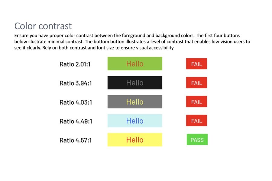
Ensure you have proper color contrast between the foreground and background colors. The first four buttons below illustrate minimal contrast. The bottom button illustrates a level of contrast that enables low-vision users to see it clearly. Rely on both contrast and font size to ensure visual accessibility
Illustrations courtesy of Level Access.