Visual accessibility serves clients more effectively, heads off potential risk
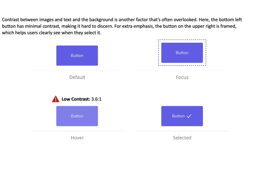
Contrast between images and text and the background is another factor that’s often overlooked. Here, the bottom left button has minimal contrast, making it hard to discern. For extra emphasis, the button on the upper right is framed, which helps users clearly see when they select it.
Illustrations courtesy of Level Access.